Anyone else remember several years ago, when one of the big discussions in the online sewing community was creating personal color palettes for our sewing? I came up with this palette during that time, and have been basing most of my personal sewing and fabric purchases off of it since.

Oh, hi, circa 2001 Photoshop! As you can see, the palette mostly consists of my favorite oceany tones, a few warmer colors that I’ve been making an effort to pull in (a sunflower-ish yellow, coral, and orange), a nice plummy purple, and a few neutrals. The navy is mostly in terms of denim in my real life, I don’t really wear tan these days because it makes me feel kind of naked, and though it’s hard to see, the white is really more of an ivory tone. I’ve also been leaning more towards seafoam/minty than that nice kelly green, just because of the fabrics I’ve been finding.
Fast forward to this year. I occasionally listen in on those online summits where they have 2-3 days of recorded sessions on a various topic, and you can either try to cram in as many in a 24 hour period as possible, or pay for lifetime access and some extras. There’s a page on Facebook called HobbyScool (no, that’s not a misspelling) where I’d listened through a summit previously, and a recent one they had was called “Chic and Confident”, and all about personal styling and fashion and such. A lot of the speakers focused more on working women and style as it relates to personal branding, so not exactly relevant for my stay at home/schooling mom, very non-entrepreneurial lifestyle, but I still thought it might be interesting to listen to some of the other sessions from the perspective of someone who’s trying to build a wardrobe through sewing instead of shopping. I did hear some interesting things, and in the process, I won a bingo prize for a professional color analysis and a “style audit” call. So I thought it might be fun to share the experience. This is probably going to be a longer post, so I’ll stick with just the color analysis for this one.
I wasn’t really sure what to expect. We did it over Zoom, after I’d submitted some photos and other basic information. and we chatted about my current wardrobe, my lifestyle, and my goals for my wardrobe. She thought the sewing angle was really interesting, and complimented me on the dress I was wearing when I was showing her some of the pieces I have in the closet, even though apparently it was completely the wrong color scheme for me. She told me that rather than the old color “season” system that I remember from when I was a kid, she looks at the contrast between eyes and hair and skin. I always thought that was a pretty high contrast thing for me, since my eyes are a rather dark brown, but she pegged me more as a medium contrast to go with my hair. Apparently this translates to soft, which instantly had me worried that what I look best in is pastels. I am not a fan of that color scheme. Thankfully, when she showed me the color palette, there were still a lot of brighter shades on there, including some lovely tealish-turquoise swatches, which is absolutely my #1 go to. But there were still quite a few surprises, which I’ll get to in a moment.

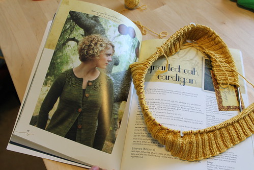
So how did I do with my original palette? I went ahead and made a version to compare, with my old color picks on the squares and the colors she sent me on the diamonds. Overall, it looks like what she sent me is just cooler or lighter versions of the colors that I already picked. Though I’ll admit that there are some disappointments. For one, my #1 color to avoid is black, which features heavily in a lot of the prints I already have sewn or have in my stash. My best neutral is apparently that tan, which as I said, makes me feel naked. I’m much more comfortable with brown and dark denim navy. And though I do have some grey things that I wear, namely the one sweater I managed to successfully knit, it’s not really a color I prefer. To me, it’s a color that speaks of winter and rainy days that set off my mold allergy and sadness, and that’s not really the feeling that I want to have when I get dressed in the morning.
I’ve also come to really enjoy certain warmer colors, like a bolder mustardy yellow and orange, and those apparently look better on me as a more muted shade. Or, in the case of orange, not really at all. And the plum that I’ve been using as my go-to purple isn’t even on the chart. Also, most of the brighter colors are pinks. Soooo much pink. I can’t share the full palette on here, since it’s a private link, but there’s something like 8 of them. Also, apparently my best prints are “low to medium contrast”, which leaves me a little sad. Basically, one of the key words she used was “subdued”, and that is definitely not what I’m naturally drawn to when it comes to prints. (Also, apparently one of my best eye makeup colors is taupe. TAUPE. UGH. I refuse.)
I did seem to hit some things right, though. Like that last coral that got layered with the orange is almost identical to the coral on my 2014 palette. Some of these were limited by my old Photoshop and my ability to use it at the time, and I’ve learned a lot since then thanks to digital scrapbooking. With the neutrals, especially, it looks like they’re mostly just slightly cooler shades of what I’d originally put on there, and I naturally gravitate towards cooler colors anyway. And my instinct that ivory is better on me than white seems to have been spot-on. She did say that I can pull off both gold and silver jewelry, which is good. (And more muted animal prints as a neutral, which is really not my thing.)
I don’t want to sound ungracious towards the consultant, as she was very encouraging and understanding of the fact that I’m probably not going to want to throw out a bunch of clothes that I made just because they’re not necessarily the best colors on me. She gave me some good tips about how to mitigate that with accessories. Overall, I want to look at this as a positive step in my ongoing quest to have an amazing, mostly me-made wardrobe. And since I thought it might be fun to see what in my current me-made wardrobe does fit that palette and has survived the last decade of sizing changes and motherhood, I made a collage.

From top to bottom, left to right:
- My ivory Helen’s Closet Blackwood, paired with a predominiately navy Itch to Stitch Mountain View jean.
- Navy/ivory True Bias Lander shorts. (I thought these were out, but I was recently able to pull these out of my refashion bin, thanks to the weight loss. I no longer have that tank top.)
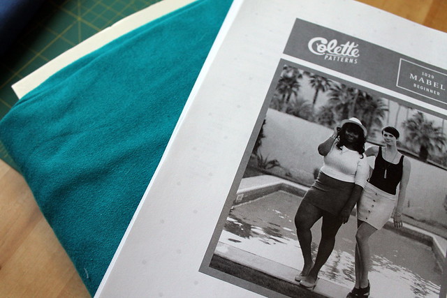
- Colette/Seamwork Moneta dress, that I modified the style of to match Belle for a DragonCon costume. I don’t wear this much since I don’t know what to pair it with, but this is pretty much a perfect match for a “denim” on the extended palette.
- Deer and Doe Reglisse Dress. The one thing I own that has that lighter purple, the teal is pretty close, and the overall print is more muted than what I often go for.
- The oldest surviving wardrobe piece is this Butterick dress, which is pretty much all the “denim gray” from the extended palette, ivory, and the green from what I showed.
- Surprisingly, this flamingo shirt, which has more pink and lighter blues than I usually wear. Even the hot pink binding looks like it’s on the palette. I’m sure flamingos aren’t subdued, but they’re fun.
- The color analyst would probably not count this ice-dyed skirt, but it’s got so many shades of blue and green and even those purples that I think it has to count. It’s not right next to my face anyway.
Row 2: - Though this one is getting pilled enough that it’s on its last legs, this green/teal/brown Seamwork Mesa dress.
- Also, my Sewaholic Cambie teacup dress, which I’m quite happy that it fits again.
- McCall’s button-down tunic, which is mostly navy with speckles that fit the other colors (seafoam, turquoise, even some pink)
- Deer & Doe Plantain, which is predominiately ivory and seafoam.
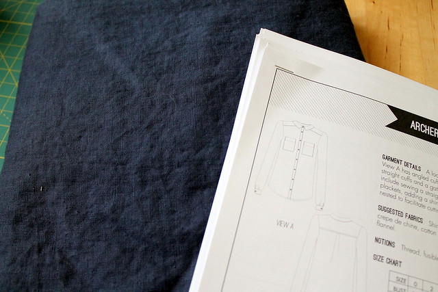
- Grainline Archer shirt, in navy with ivory stitching. (Wow, I was so pregnant in this pic.)
- Paprika Patterns Jasper sweatshirt, in this happy “pool” blue.
- Itch to Stitch Mila shirt. Plaid would probably be labeled as too high contrast, but it’s one of the few things I have that leans on grey rather than black to go with that teal. Plus I like plaid.
Row 3: - McCall’s Mimi G dress-hacked-to-shacket, in navy.
- Seamwork Bristol skirt and Astoria sweater, in seafoam and brown. One of the few things I have that are brown, honestly, though it’s still a color I like.
- This hacked Simplicity tie-dye skirt, in navy/grey. I’m wearing it as a maternity skirt in this shot, but I still pull it out thanks to the yoga-style waistband. Though I’ve been lacking in things to wear on top with it recently.
- The Blackwood cardigan, this time with my other Mountain View jeans. They’ve gotten a bit faded since this picture, but still fit the blues.
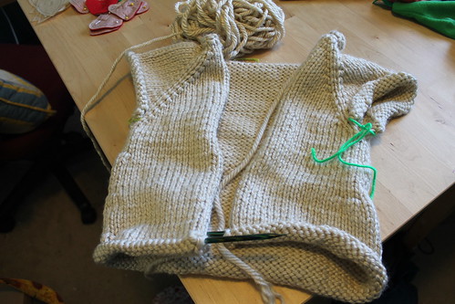
- My Roheline knitted cardigan, and one of our dogs that has sadly passed since then.
- Sew Liberated Stasia tee, in coral.
I’m realizing, now that I’m looking at this collage again, that there’s a few things I overlooked. Like this Renfrew tee, and this flamingo skirt. Apparently, pink is a much easier pill to swallow when it comes in the form of tropical birds.
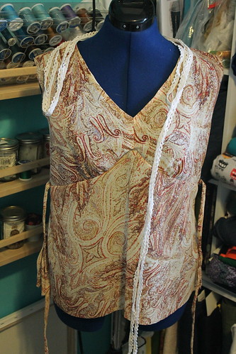
So, basically, I have a bunch of stuff I could build off of, but not necessarily a lot of things that work together. And what does this mean for the rest of my wardrobe and fabric stash? Well, I’m not going to ditch it. To be perfectly blunt, even if it is my worst color, I wouldn’t ditch my black clothes anyway. Besides being required for my orchestra concerts, I know that my black Appleton dress is one of my husband’s favorites. And some of my favorite me mades that I still have don’t fall into this palette at all. Like this dress. Or the refashioned top from this dress, which I don’t have a dedicated post to link to. I just like brighter colors and bold prints. They make me happy. And I do think that happiness and fun with my wardrobe is just as important of a factor as what colors would look best on me.
I may be willing to consider this palette in future fabric purchases, though, especially in adding things like that darker brown and those brighter blues and greens. Or maybe I’ll just grab some henna and start dyeing my hair red again. And work in the colors that I’ve loved and feel good wearing anyway, like plum and especially ALL the teals.
One important takeaway that I did have from this whole conversation, too, is that I do need to focus on some well-fitting basics to pull all of these together. Aside from the turquoise Mountain View jeans, I have one pair of jeans left that is not literally falling apart. Two, if you count the one I’m visibly mending every time a new hole pops up. And I don’t even know what tops to wear with my skirts half the time. I do have a lot of navy-toned denim in my stash, so that could be a good place to focus on. But I think I’m going to alternate that with some fun prints that may or may not be the best colors for me, because all solids and no prints makes me a cranky sewist.


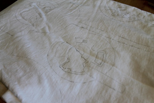
 (Serious work in progress here, as I’d love to eventually add photos of the things I actually have done.)